


Extra Gum | Global Relaunch
Extra Gum was seen as a functional, dental-hygiene brand. Useful but uninspiring. It lacked emotional resonance it once had, especially with younger, digital-first audiences. Even the old “Ding” icon felt static and out of place. The brand needed to evolve from a category cliché to a confidence-driven lifestyle emblem without losing its core identity.
The vision was clear. Transform Extra from a purely functional gum into a brand that celebrates moments of confidence and refreshment. This meant:
Repositioning the brand to focus on self-expression and emotional resonance, not just freshness.
Retaining the brand’s foundational cues. Its signature colors, shield motif and product recognition while modernizing every detail for a global, digital-first audience.
Building a versatile visual system that could flex effortlessly across packaging, in-store displays and digital environments, remaining expressive and culturally relevant in every market.

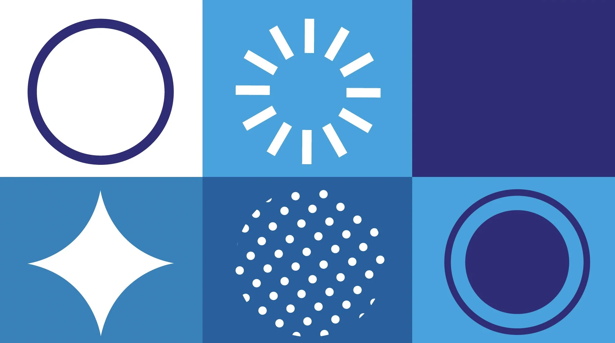
Bringing the Ding to Life
After modernizing the “ding” and giving it fresh meaning for a new generation, we needed to show people what it felt like. The rebrand wasn’t just a visual update, it was an invitation to rediscover the spark that makes you, you.


A fresh look for the world’s best-selling gum.
Extra’s iconic “Ding” was ready for a new chapter. Partnering with Elmwood, I led the global creative direction and teams to modernize the brand without losing its spark. Transforming it from a functional gum into a symbol of everyday confidence and rolling it out seamlessly across markets worldwide.
Get Your Ding Back
We launched with a hero film that took the “Ding” from concept to emotion. In a world that had lost some of its mojo, Extra became the small but powerful spark that could bring it back. The spot used warmth, humor and relatable moments to show how a simple stick of gum could shift someone’s whole vibe. Reminding audiences that their confidence was always within reach.
Do What Makes You Ding
The second film built on that momentum, reframing confidence as self-acceptance. It celebrated everyday quirks, bold choices and unapologetic moments of self-expression. It proved that the “Ding” isn’t about changing who you are but embracing it fully. Together, the two films created a narrative arc: first, find your spark; then, live in it.

Social: A Constant Source of Confidence
To keep the “Ding” alive beyond the films, we translated it into social content built for quick, joyful impact. Motion graphics, AR effects, and playful photography brought the identity to life in ways that stopped thumbs and sparked shares. Every asset carried the same confidence-forward energy, making the “Ding” instantly recognizable in feeds around the world.


Dingfluencer Program:
Confidence, Shared. We extended the story into culture through the Dingfluencer program. We partnered with creators who embodied their own version of confidence. From style leaders to artists to everyday icons, they showed that “Ding” can be as bold, subtle, weird or wonderful as you want it to be. By sharing their personal sparks with their communities, they turned the campaign into a conversation, inspiring others to find and celebrate their own.